In premium cigarettes, few brands like Davidoff Gold evoke refinement and subtle luxury. Known for its smooth flavor profile and consistent quality, Davidoff Gold distinguishes itself in a less-discussed but equally important aspect: packaging design.
Davidoff’s branding is more than just a name—it’s a lifestyle. And nowhere is that more evident than in the sophisticated packaging surrounding each box of Davidoff Gold cigarettes. In this article, we explore the story, symbolism, and strategy behind the brand’s elegant packaging—revealing how visual design enhances consumer perception, reinforces luxury positioning, and reflects a legacy of taste and class.

1. A Legacy of Elegance: Davidoff’s Brand Philosophy
Founded by Zino Davidoff, the brand has long positioned itself as a symbol of refined living. Initially gaining fame through premium cigars, Davidoff transitioned into cigarettes while preserving its commitment to exquisite design, craftsmanship, and understated luxury.
This ethos translates into every element of Davidoff’s product presentation—from typography to color palette—creating an identity that appeals to those who appreciate quality and discretion.
2. First Impressions Matter: Packaging as a Status Signal
Packaging isn’t just a protective layer—it’s a powerful communicator. For a premium product like Davidoff Gold, the visual language of the packaging plays a critical role in setting it apart from generic brands.
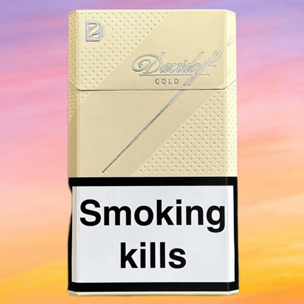
The box is instantly recognizable with its minimalist gold and white color scheme, clean lines, and modern serif logotype. This design quietly signals sophistication without resorting to bold graphics or heavy branding. It reflects restraint, maturity, and confidence—key traits of Davidoff’s target audience.
3. The Color Psychology Behind “Gold”
Gold isn’t just a color—it’s a message.
In luxury branding, gold is often associated with:
- Prestige
- Exclusivity
- Timelessness
- Warmth and indulgence
By adopting this tone, Davidoff subtly positions its Gold variant as a superior, smooth-smoking experience, appealing to connoisseurs who seek elegance over flash.
Pairing gold with a crisp white background enhances this contrast. The result? A box that feels clean, high-end, and iconic—even when viewed from a distance.

4. Typography and Iconography
The Davidoff script logo, which has remained unchanged for decades, adds a personal, signature-like touch to the package. It feels handwritten yet luxurious, evoking craftsmanship and human artistry.
Below or beside the logo, the word “Gold” is typically printed in soft metallic hues, often embossed to add tactile appeal. This detail invites touch—another sensory interaction that reinforces the premium perception.
5. Material Quality: Feel Equals Value
Luxury isn’t just seen—it’s felt.
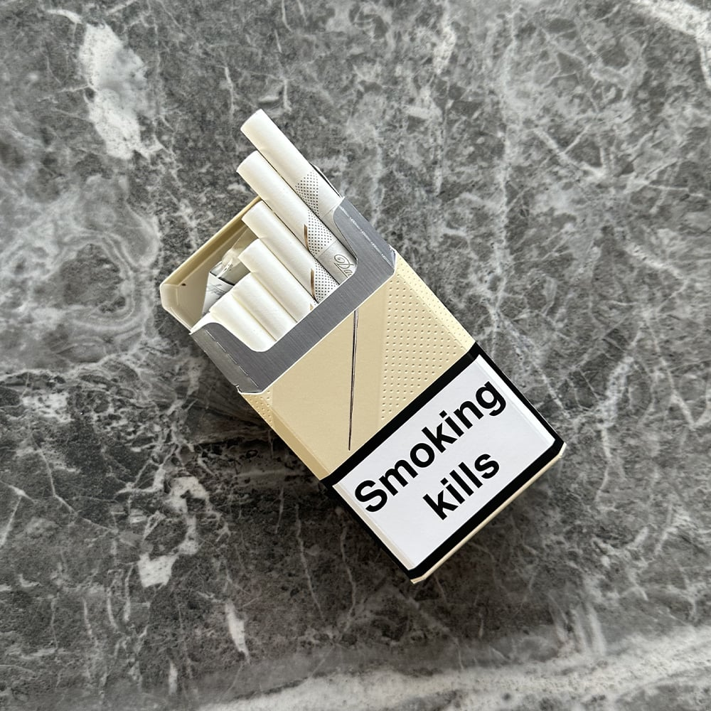
Davidoff’s packaging uses higher-quality cardboard stock, smooth matte finishes, and foil-stamped accents. These subtle enhancements create an unboxing experience more commonly associated with upscale cosmetics or high-end electronics.
For many buyers, the physical feel of the box contributes directly to the product’s perceived value, making the smoking ritual feel more refined.
6. Packaging Compliance with Branding Integrity
In an era where tobacco packaging is increasingly restricted by regulations (such as health warnings and plain packaging mandates), Davidoff manages to preserve its branding integrity without violating legal requirements.
How?
- Subtle branding: Unlike oversized logos or bright colors, Davidoff focuses on proportion, spacing, and font hierarchy.
- Premium finishes: While many brands settle for glossy, loud designs, Davidoff keeps things matte, refined, and quiet.
This balance allows the brand to maintain a luxury image even within a regulated industry.
7. Packaging as a Global Language
One of the strengths of Davidoff Gold’s packaging is its universal appeal. It doesn’t rely on language, culture-specific symbols, or gimmicks. Instead, it speaks in a global design language—minimalism, gold accents, tactile quality—that resonates from Tokyo to Berlin to São Paulo.
This global consistency reinforces the idea that Davidoff is more than a cigarette—it’s an international symbol of taste.

Final Thoughts: More Than Just a Box
The packaging of Davidoff Gold isn’t merely a design choice—it’s a strategic brand expression. Every element—from the gold accents to the feel of the material—conveys a story of sophistication, class, and timeless elegance.
In a market where first impressions can determine brand loyalty, Davidoff has succeeded in turning its packaging into a silent ambassador for its values. It stands as a testament to the power of design in shaping perception, especially in the luxury category.
So next time you see that understated gold-and-white box, remember: it’s not just a cigarette pack—it’s a reflection of a century-old commitment to refinement.