Marlboro is synonymous with heritage, quality, and bold identity in the world of premium tobacco products. While most consumers recognize the red chevron and cowboy silhouette, fewer are familiar with the brand’s exclusive Platinum line—a refined expression of Marlboro’s ongoing evolution.
Marlboro Platinum is more than just a cigarette variant. It is a visual and sensory statement, reflecting sophistication in every detail—from the smooth blend inside to the meticulously engineered packaging and design aesthetics. In this article, we deeply dive into the packaging philosophy, visual cues, and tactile experience that define Marlboro Platinum’s premium identity.

🔍 The Concept Behind Marlboro Platinum
Launched as a modern luxury alternative to traditional Marlboro products, Platinum seeks to attract a more urban, style-conscious demographic. The product is designed to feel sleek, minimal, and upscale, standing apart from the more rugged, classic Marlboro Red.
This strategic positioning focuses on:
- A clean aesthetic that appeals to modern minimalism
- Enhanced packaging materials and tactile finish
- A quieter, more refined identity compared to bold heritage designs
Marlboro Platinum doesn’t shout; it whispers class.
🎨 A Study in Design: Minimalism Meets Precision
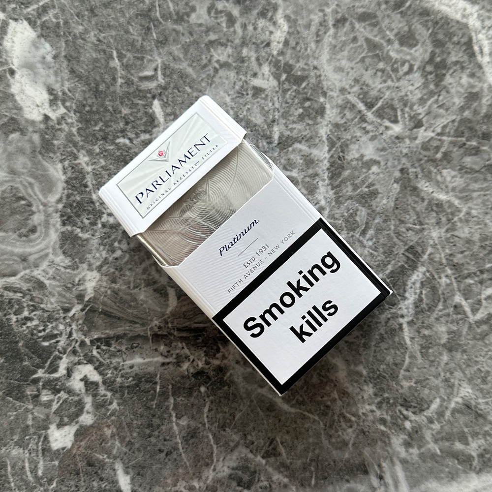
The design of Marlboro Platinum is strikingly monochromatic, with silver, platinum grey, and soft white tones dominating the palette. The absence of loud colors is intentional—it reflects clarity, restraint, and refinement.
Key design features:
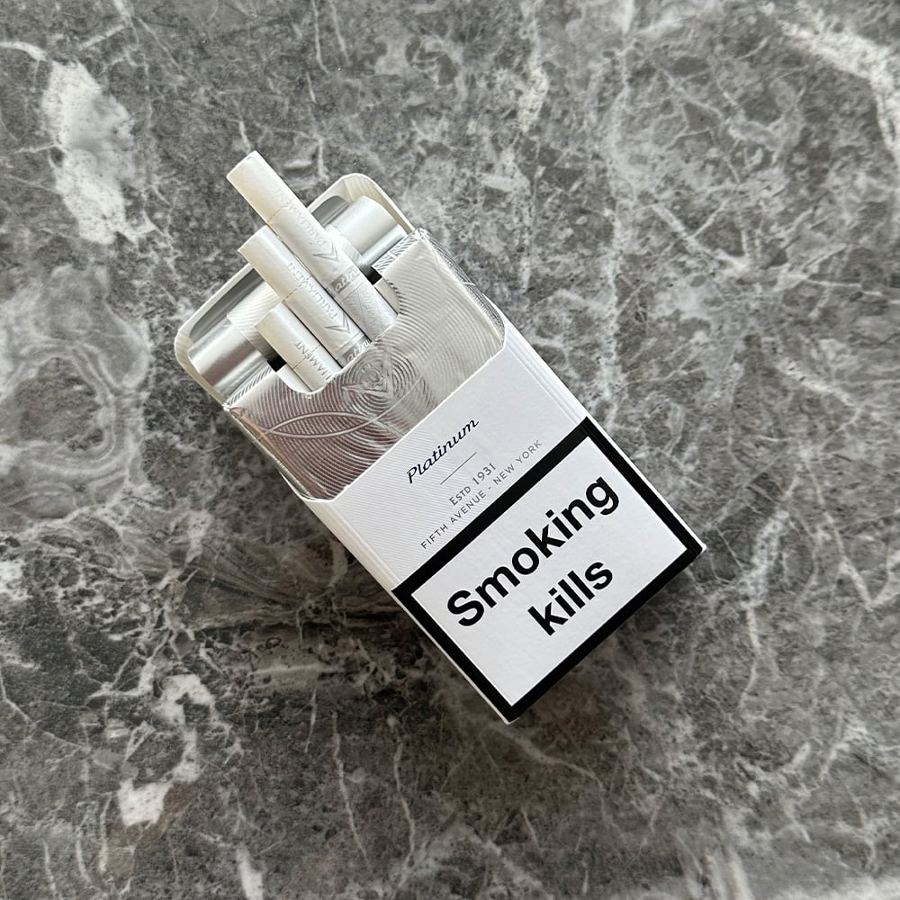
- Subtle embossing on the pack surface for a tactile, luxurious feel
- Matte finish rather than glossy, reducing fingerprints and glare
- Laser-sharp typography, often in silver or light grey, signaling premium quality
The chevron—an iconic Marlboro design element—is still present but redesigned. On the Platinum variant, it is slim, understated, and slightly raised, creating a sleek silhouette rather than a bold statement.

📦 Packaging Materials: Touching Luxury
While most cigarette packs are cardboard and foil, Marlboro Platinum enhances the tactile experience. The outer packaging is denser and smoother, giving the pack more weight in hand—an intentional decision meant to trigger a luxury association.
Other notable details:
- Soft-click pack open mechanism that feels engineered, not mass-produced
- Thinner foil inner seal with a smoother tear line
- Cleaner interior lines with reduced branding clutter
These combine to deliver an “Apple product unboxing” type of feel—rare in tobacco but increasingly desirable.
👁️ Visual Identity and Shelf Presence
Marlboro Platinum was designed to stand out through contrast. Platinum’s cool-toned minimalism becomes its loudest statement on a shelf filled with red, gold, and black cigarette packs.
It appeals to consumers who:
- Avoid overt branding
- Prefer design-driven purchases
- Are influenced by tactile, minimalist packaging experiences
While the taste profile remains aligned with Marlboro’s smoother blends, the presentation wins hearts in the first few seconds.

🎯 Target Demographic and Positioning
The Platinum variant aligns with:
- Younger adult smokers in urban environments
- Professionals who value subtle branding
- Design-oriented individuals who equate aesthetics with quality
Marlboro Platinum successfully positions itself as the “designer cigarette” of the lineup by borrowing cues from tech, fashion, and luxury goods branding.
🧠 The Last One: When Branding Becomes an Experience
Marlboro Platinum isn’t just a cigarette—it’s an experience of form, texture, and subtle storytelling. Every detail, from the embossed logo to the soft-click pack mechanism, tells the consumer that this is something refined, considered, and modern.
In a market often saturated with over-the-top visuals and loud color schemes, Marlboro Platinum dares to be quiet—and in doing so, it becomes unmistakably memorable.
Whether you’re a branding enthusiast, a packaging design professional, or a curious consumer, Marlboro Platinum is worth examining for what it contains and how it presents itself to the world.